branding · football
Bandeirante EC
Eternal
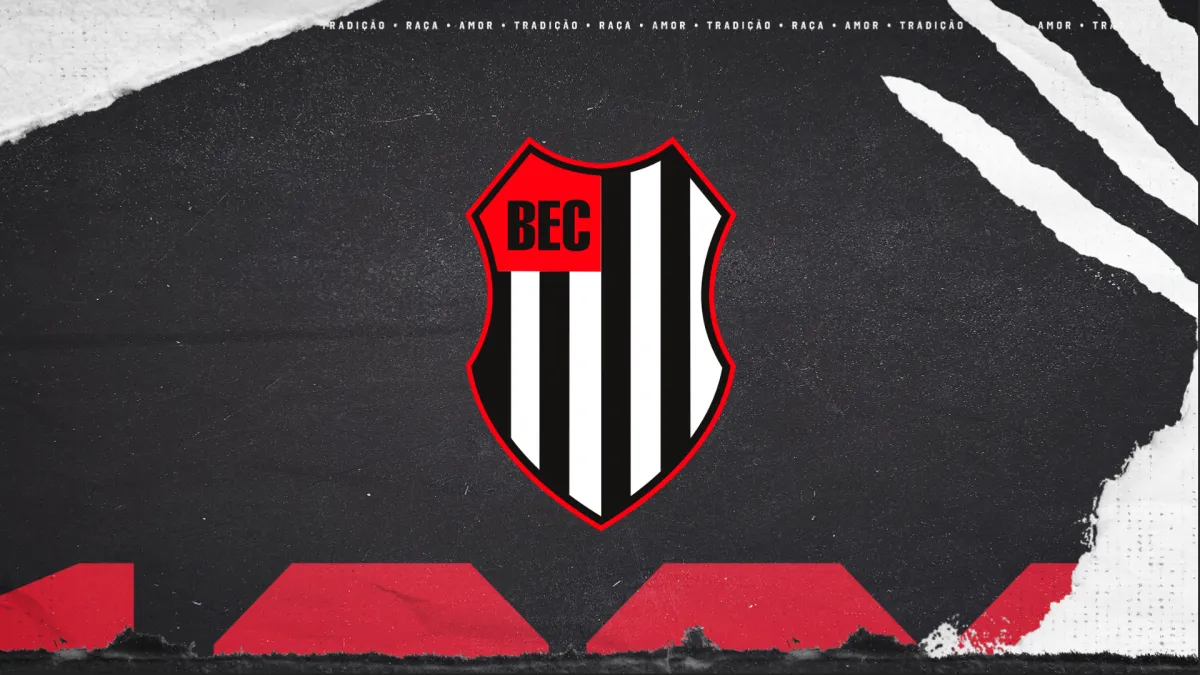
Visual system for Bandeirante Esporte Clube, the Lion of the Noroeste from Birigui, founded in 1923: a redrawn crest and a brand that holds up on the terraces, on the shirt and in the feed.
01The challenge
A club founded in 1923 carries a crest nobody has the right to ruin. Bandeirante needed a visual system that worked on the shirt, on the terraces, on signage and in a story without losing the face of a century-old side, and without becoming generic football branding.
02What we did
We redrew the crest respecting the heritage of the black and white stripes, and brought red in as the colour of tension. We fixed three words as the spine of the system, tradition, grit and love, running in a continuous band. The Lion of the Noroeste claw became texture rather than literal drawing, and torn paper gave the whole thing the roughness of a matchday poster.
03The delivery
A consistent brand from the crest to the social post, ready for the Paulista Série A3 season and for the crowd to recognise from a distance.
// project gallery
This project used